THOMAS MAYFRIED : EPHEMERA, GRAPHIC DESIGN, ETC
Following a period in which many exhibitions were dedicated to Classical Modern art, Chris Dercon took over as director of the Haus der Kunst in 2003 and again opened the institution’s program up to architecture, design, fashion, film and photography. In an effort to inform the public of these changes, Chris Dercon and his team sought a new graphic appearance and invited several graphic designers to participate in a competition. nst’s graphic appearance at the time in order to make a clear breaThe proposals made by the Munich-based graphic designer, Thomas Mayfried, showed that the designer had spent considerable time examining the Haus der Kuk with the past in his own new Design.
The building’s corridors, for instance, still contain much of their original lettering . the sans-serif capital letters from the 1930s. For more than 50 years the Haus der Kunst’s logo depicted the facade’s columns . in a sometimes more, sometimes less abstract manner. In his design proposal Thomas Mayfried suggested the opposite of what had been the norm until then: lowercase lettering and asymmetry instead of centrally placed majuscules, and the trademark name "hausderkunst" instead of the row of columns logo.
His suggestion for Haus der Kunst’s character font, which he recommended using together with Helvetica, was created by the Swiss designer, Mischa Leiner. Each letter is made up of many small dots and is reminiscent of the glowing light bulbs found in circuses, music halls, and cinemas, creating the impression of a museum as an entertainment palace.
Thomas Mayfried won the competition and, since then, has been designing all the Haus der Kunst’s graphic material including posters, banners, flyers, advertisements, orientation systems, labels, exhibition wall texts, invitations, admission tickets, stationery, postcards, shopping bags, guard t-shirts and much more.
Comparisons with other exhibition institutions show that collaborations with graphic studios do not always include the designing of all printed material and that cooperations are not always long lasting. Many such joint efforts end after just a few years because directors move on to other institutions or because designs are not implemented by the graphic studios themselves but by third parties. Museum activities operate in the divergent fields of communication, information and spectacle. The exhibition also presents examples of seminal designs that express such divergences, including work by Wim Crouwel and Experimental Jetset for the Stedelijk Museum in Amsterdam and by Spin for the
Whitechapel Gallery in London.
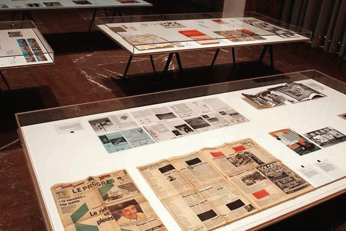
The first section of the exhibition provides an overview of the printed material Thomas Mayfried designed for the Haus der Kunst. In addition to published works, non-realized designs are also presented, focusing on the competition that frequently exists between various ideas and the individual steps taken on the path to a solution. Discarded ideas are often more radical and consequential than the actual product: the designs, therefore, provide insight into the actual constraints that had to be considered. The non-realized designs for the Paul McCarthy exhibition in 2005, for instance, exhibit clearer borrowings from pornography and splatter than the poster that was actually printed.
The second part of the exhibition presents works by other 20th century graphic designers, as well as film makers, writers and photographers: books, newspapers, LP covers, postage stamps, postcards, bookmarks, pieces of paper and other ephemera. The projects are included in the presentation because they represent two graphic strategies held in high regard by Thomas Mayfried: on the one hand how one can limit oneself to a minimum of means and still achieve maximal effect and, on the other hand, how one can undermine design practices that are typical of specific fields. Thomas Mayfried practices both strategies in his own designs.
Examples of the first strategy are provided by printed matter designed by Otl Aicher as lead designer for the 1972 Olympic Games in Munich. With Otl Aicher’s creations, the Olympic Games were given a uniform design and colour concept for the first time: from the smallest printed materials to the signpost system in the sport facilities: everywhere one could find the same blue / green / orange colour stripes and pictograms. At the same time these printed materials showed all competitions of this sporting mega-event in clearly arranged schedules and plans: schedules of event times and locations, plans of access paths and supply routes. From the basic guide printed in large numbers to the program for the closing ceremony celebrations . everything was treated with the same attention to detail. Even the smallest printed items, the athletes’ ID cards, were covered with a minute pattern of the five Olympic rings, making the card more secure against forgery. A sample for the IDs is included in the exhibition.
The second strategy is that of the mole, one that intentionally undermines certain design principals and is implemented, for example, in the annual report of Ringier AG, a Swiss media company. Since 1997 Ringier AG has entrusted the design of its annual reports to artists. Peter Fischli and David Weiss provided an anti-concept for the business year 2007: In addition to the numbers and facts, which constitute the actual annual report, about 90 % of the book consisted of advertisements that Ringier AG clients had placed that year in Ringier AG publications. In their silent succession, these ads promising glamour and happiness become an encyclopaedia of temptation and desire. This format not only showed the company’s stockholders how Ringier AG had earned its money in 2007, but was also a kind of criticism.
This group exhibiting subversive strategies includes the ten Gulden bill, created by the designer Jaap Drupsteen . a specialist in television productions . which resembles a Techno flyer more than a banknote; an election poster for the Green Party designed by Joseph Beuys on which a small lead soldier shoots at a large hare; and a poster designed by Marcel Duchamp for the Sidney Janis Gallery, depicting works of the Dada movement for an 1953 exhibition. Printed on this poster were also texts about the exhibition like those found in an exhibition flyer. The poster lay crumpled up in a gallery trash basket so that visitors had to take it out and flatten it in order to read it.
In the extreme case, the strategy of consciously undermining specific design principals leads to refusal and intentional illegibility: in a book about Marcel Broodthaers published by Nico Dockx, all illustrations of Broodthaers’ works are blacked out. Originally this book was intended to be an exhibition catalogue, which, however, could not be printed because of unsettled picture rights.
In its totality, the exhibition provides insight into Thomas Mayfried’s own designs, his influences and favourite works. The show is curated by Swantje Grundler and Chris Dercon.
Tours with Thomas Mayfried and Swantje Grundler will take place on Tuesday 25 May, Tuesday 15 June and Tuesday 27 July, at 6:30 pm.
haus der kunst
prinzregentenstrasse 1
80538 munich
t +49 (0)89 21127-113
f +49 (0)89 21127-157
mail@hausderkunst.de
Opening hours
mon–sun 10–20 h
thu 10–22 h
Image: HDK Mayfried Poster Petel